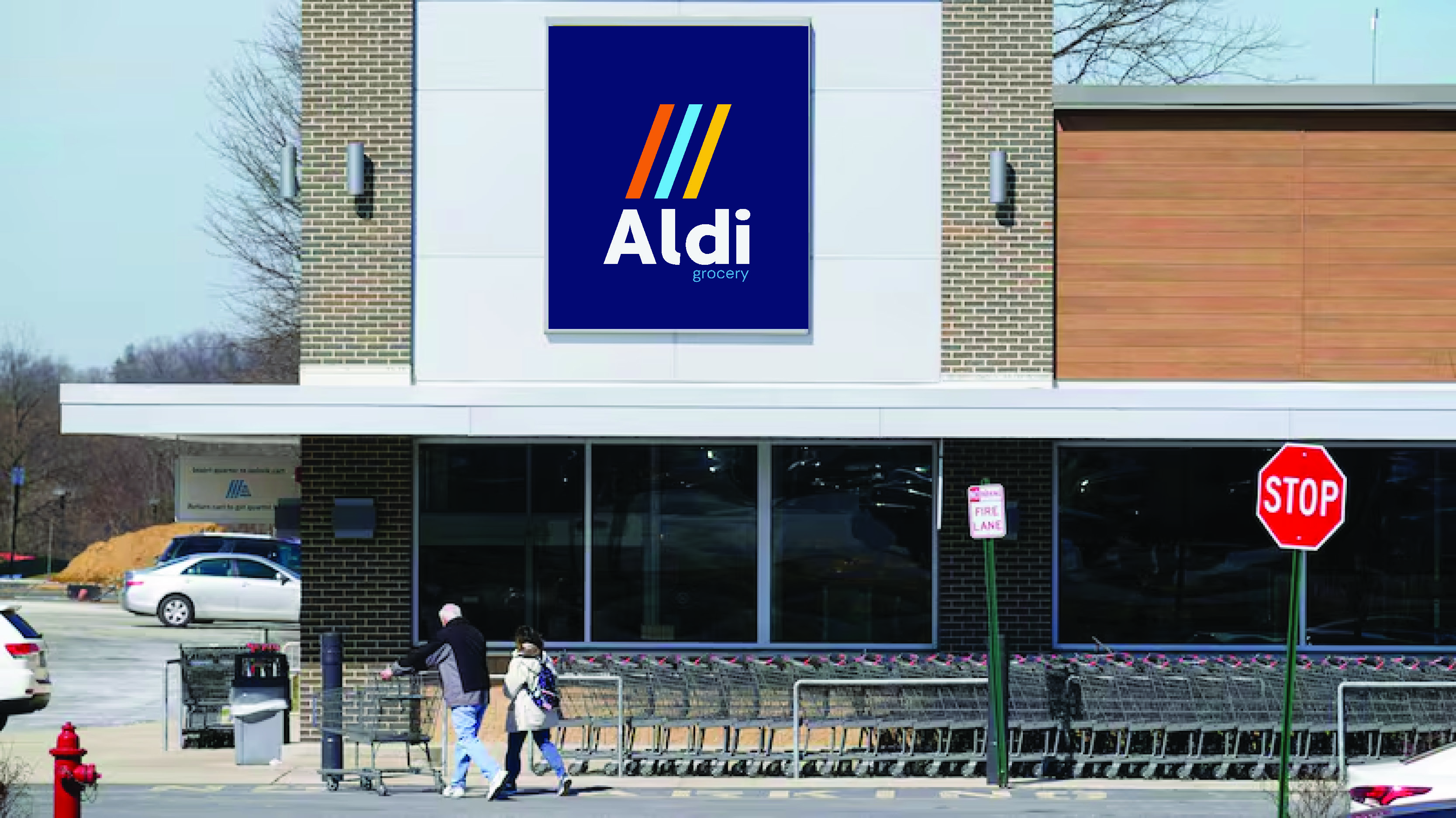
Aldi — Brand Manual
Spring 2024
Logos
The new Aldi logo system is friendly, modern, and classic. It incorporates colors from the current branding system. It is also highly flexible, with versions for both dark and light backgrounds, as well as horizontal and vertical applications.
The slight curves of the typography give a welcoming feeling, and the three lines continue the iconic imagery of Aldi's current logo.
Typography
Rethink Sans is a simple yet welcoming and warm typeface was chosen for the forefront of the brand.
*Please note that Rethink Sans is the brand's primary typeface, however Apertura is used in the logo.
Color Palette

The color palette directly pulls from Aldi's current branding, which are already strong and represent the versatility and positivity of the brand.


